Album Redesign
I’ve redesigned the album cover for Chappell Roan’s debut, The Rise & Fall of a Midwest Princess. I find the original to be successful in embodying the aesthetic and themes of the album, however not once on the entire vinyl packaging is the title written out. My version is designed into a typographical composition that is as successful at embodying the Midwest Princess aesthetic of trashy glitz and glam. Like the original, it honors the designer’s inner-child, the little girl who yearned to be a popstar and a princess, but had no interest in any prince.
Assessing the Aesthetic
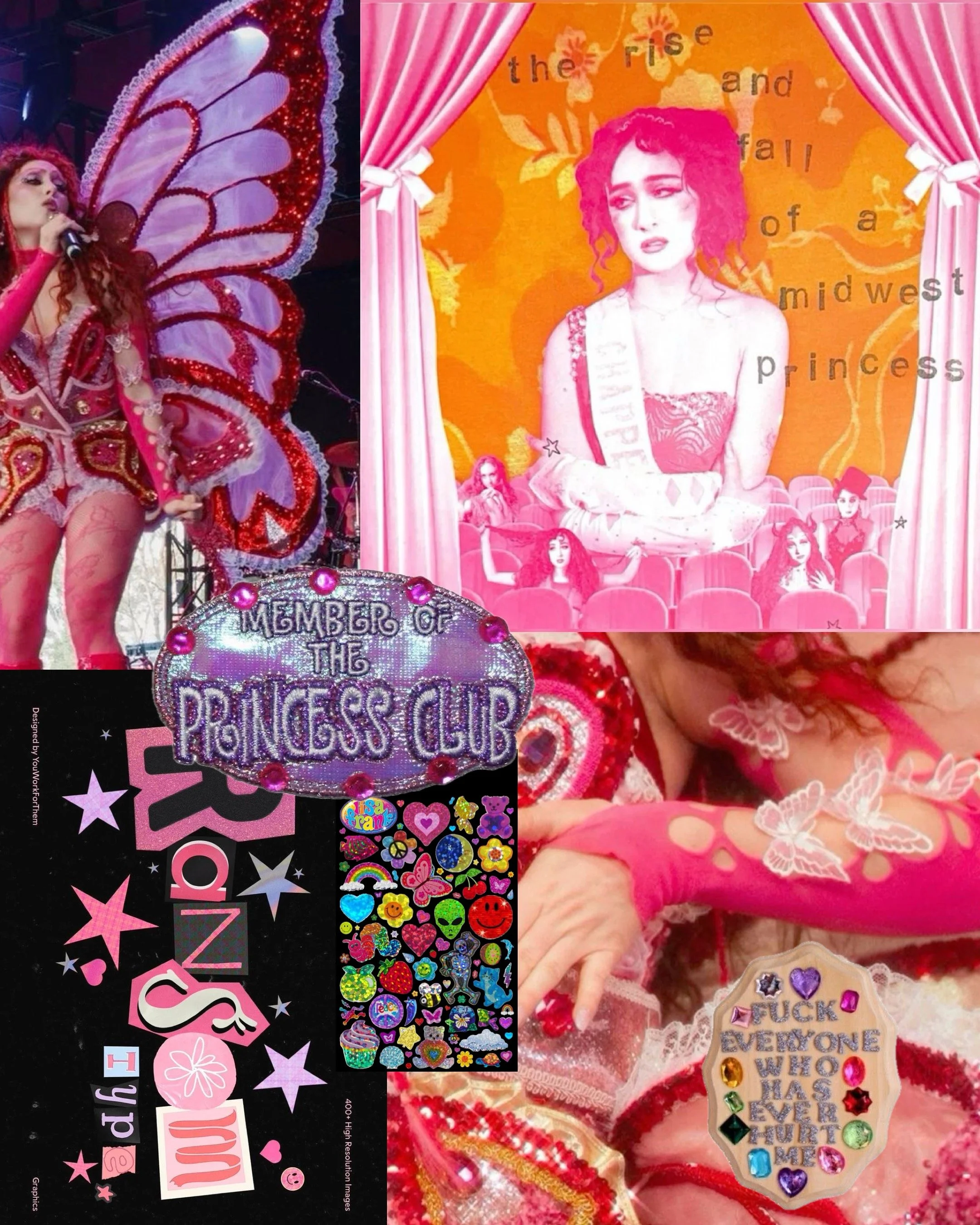
After many hours spent examining the original cover art and vinyl packaging, as well as listening to the album on loop, I became very familiar with the working aesthetic. The so-called Midwest Princess is a little kitschy, but still glamorous; it doesn’t matter if the gems are plastic as long as they still shine. Queerness is a prevalent theme visually as well as in the lyrics: Roan is dressed and made up like a drag queen as she sings about her self discovery as a lesbian. This project allows for her childhood dreams of being a princess and a pop star to come true. With all this in mind, I began to compile a mood board and got to sketching ideas.
Original Vinyl Packaging
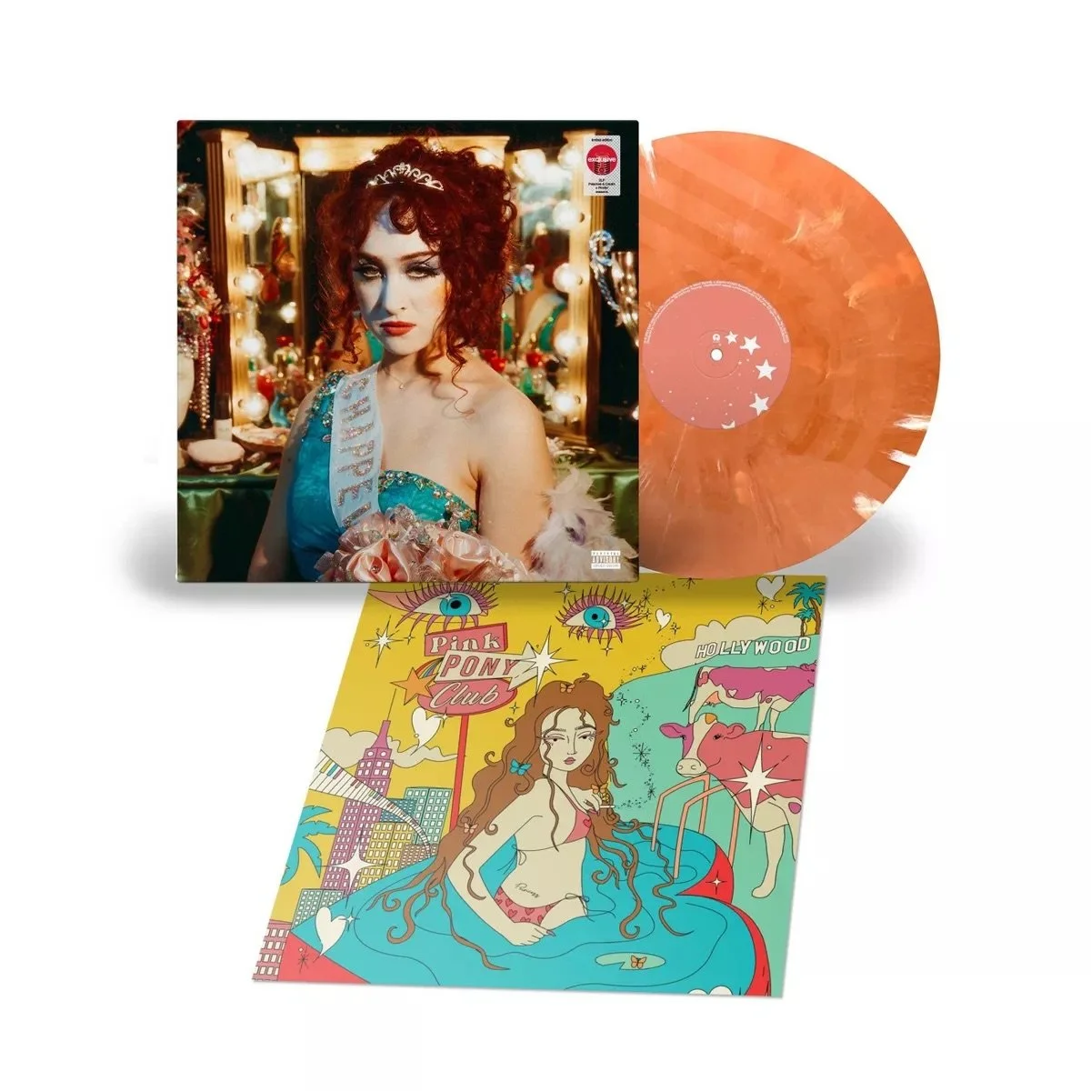
Crystals and rhinestones, plastic, sateen, and thrift store gowns; glitz and glam meet white trash to make the Midwest Princess. Reflective of Chappell Roan’s own midwest upbringing, her stage name a nod to her grandfather, the debut album cover is a childhood dream come to fruition. In an interview with CNN, Chappell says of her creative director “Ramisha is so inspiring to me because she really leads with her inner child and what is cute and makes her feel good. That is how I try to run my project – as genuine as possible and honor my inner child” (Wagmeister 2024). Endless details and meaning could be parsed out from each trinket on the vanity, perhaps even more so than the initial intention while laying the scene. A tube of lipstick could have been their first, gifted to them by their mother. A heart-shaped perfume bottle could be filled with the sweet, fruity scent of the cloud of body spray in a middle school girls’ locker room. Leading with intuition allows for a true reflection — the creators’ intuition reflects the viewers own history back at them. In honoring their inner children, Chappell and Ramisha have allowed for fans to honor and heal their own.
The Redesign
Authentically reflective of the creations of a teen girl with some magazines, plastic craft gems, and a pack of Lisa Frank stickers to collage with, I let my inner child creative direct. The color palette includes orange, white, and pink which are the colors of the Lesbian flag, an identity held proudly by both Chappell Roan and myself. The font choices are indicative of the phrase they portray, without putting too much weight on the decision to reflect the finite choices of physically collaging from whatever magazines are on hand. Visual movement is given by skewing “Rise” and descending “Fall,” aiding in the visual storytelling of the trials and tribulations Chappell sings about. The artist’s name is depicted in a font that references playful hand-drawn lettering found in the margins of a teen’s notebooks, as well as Chappell Roan’s existing sparkly logo.


